The Italian Genealogical Group (IGG) is a world-renowned research organization that has compiled over 16 million entries of municipal, naturalization and other genealogical records. These records are free to the public and available on their website. The group also conducts monthly, in-person meetings where they provide workshops, speakers, one-on-one coaching and a wealth of other resources and information.

The IGG relies heavily on membership dues to fund their research and activities. However, their website did little to encourage visitors to sign up and the registration process was entirely offline. The online databases were not intuitive for beginner researchers and the website did not provide added value for members. As a result, membership was dropping and the board worried that their organization might not survive.
The board president, a friend, approached me for help. With the Savvy Marketing Group, I took on the role of project lead. This included research and strategy, information architecture, user experience design, visual design and front-end development. The Agency team included an Account Manager and a Web Developer, and the stakeholder team included about 10 members of the IGG board and committees.
Our main goals were to:
- Encourage website users to become registered members
- Streamline and automate the membership process
- Update the research database with new data that the client had collected
Understanding the problem
We started out with a comparative study of genealogical research communities, collecting observations on each group’s website. I then collected these observations in a comparative brief, with recommendations on best practices for the new design.
We started out with a comparative study of genealogical research communities, collecting observations on each group’s website. I then collected these observations in a comparative brief, with recommendations on best practices for the new design.

I interviewed the IGG board and committee chairs to understand their business goals and gather information about how the group served its members. I gave particular attention to their membership management process.
Direct user feedback came through contact form submissions, many of which contained complaints about lack of content or difficulty managing their membership.
Finally, I reviewed the list of current members for demographic data, to better understand their user base.
Based on this research, we discovered that:
- There was an even split between members who lived close enough to attend monthly meetings, and those in other locations. This meant that half the user base had access to resources that the rest did not.
- Most new members expected access to additional website content or features once they signed up and were disappointed to find this was not the case. This resulted in many immediate cancellations.
- The current membership management workflow required a great deal of manual work, putting a strain on the group’s aging volunteer committee members.
Early challenges
We still needed a strategy to update the research databases, which presented two big issues:
- The research data was not properly integrated into the current WordPress site. Rather than using a system of categorized posts to contain each record, the data was imported directly into the website database. This integration is against best practices and prevented us from safely updating the WordPress software or plugins.
- Through interviews with the board president, I learned that many of the IGG’s research databases had been built and maintained with a sister organization, with a shared codebase used on each group’s website. About two years prior to the project, this arrangement was ended. All records were brought in-house, however, new admin tools needed to manage database records were never completed. This lack of admin tools cut off an important pathway for research data updates and left them unable to add or update records.
So, in addition to redesigning the UI of the research pages, we needed to extract the records from the WordPress database and store them elsewhere. I also needed to see if we could find a way to mend fences with the sister organization so we could go back to sharing data and get IGG’s records up to date.
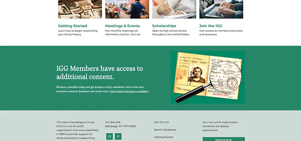
Expanding the site with new content and features
We created a Getting Started section, which included a step-by-step guide to genealogical research, an FAQ section and several worksheets and charts to help new researchers. All of these materials were provided at in-person meetings and would be made available on the website for the first time.

The board was well prepared to add value to the website. They provided over 25 years’ worth of monthly newsletters, videos and handouts from presentations, member stories, maps, and photographs, as well as exclusive research databases. All this content had to be named, tagged with meta data and organized into a password-protected Members Section.
Additional pages were also needed for member registration, account management and a shopping cart. The Join Page was redesigned from a PayPal link into a sales page with a complete list of member benefits.

Building the framework
One of my priorities for the project was making sure the website maintenance would be efficient and affordable. This meant choosing well-managed WordPress themes and plugins to ensure that updates would be available to keep the site running for years to come.
I selected the Genesis theme and Outreach Pro child theme as the foundation for the site’s UI, and the MemberPress plugin to manage member registration, accounts and paywall-protected content.
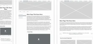
Wireframes and Prototyping
I wireframed full page layouts, incorporating design patterns to help build familiarity throughout the site. These wireframes were shared with stakeholders to gather feedback, then built up into low-fidelity interactive prototypes.
Initial iterations of the UI involved slide-in menus on either side of the page, creating consistent navigation for desktop and mobile. Later iterations replaced the slide-ins with page-specific navigation, such as jump menus and tabbed sections.

Visual Design
Initial visual designs were presented as Style Tiles; a one-page style guide / mood board that includes colors, typography, images, textures and button styles to demonstrate a general look and feel. The approved look was applied to the interactive prototype as I built it up from low to high-fidelity.
Vintage photos provided by the board were used throughout the site and given a stacked treatment to give them a consistent look throughout. This helped provide a feeling of authenticity on each page, and many came from the board’s personal photo albums.

Additional Challenges
During development of the membership features, there were several discussions about payments. Several board members were adamant that despite their requests for subscription renewal features, users also have the option to register for non-renewable, one-year memberships. I revised the strategy to offer four membership options:
- Online Only (Auto Renew): an annual subscription with monthly PDF newsletters via email
- Online Only (One-Time): same as above, ending after one year
- Printed Newsletters (Auto Renew): an annual subscription with monthly printed newsletters, in addition to email
- Printed Newsletters (One-Time): same as above, ending after one year
I then configured the membership plugin to send email notifications one week before a membership was to expire, providing a path from a one-time membership to a renewable subscription. This provided the flexibility the board wanted for their members, while maintaining an automated process.
One of the most challenging parts of this project came when it was time to import and test data. I imported membership data from Excel spreadsheets converted to CSV files, but to ensure quality assurance, I had to check each of the over 2,000 memberships by hand to be sure the imported data matched the spreadsheets on file, and that all active members would have full access to Members Only content.
While this work was going on, I was still trying to restore data sharing between the IGG and their sister organization. I had built a relationship with the other organization’s webmaster, learned much of the history behind the split and got her to agree in theory to a new co-hosting arrangement between the two groups. However, slow communication forced us to move forward without a firm agreement in place. The research data was moved to Amazon Web Services, and plans for a proper data management tool were pushed to a to-be-determined next phase of the project.
Final design and launch
After development, data import and testing, the website was tested with board members in the development environment. Confident with the state of the system, we soft launched to the public.
About two weeks after the soft launch, a formal communication was sent to all members announcing the new website with instructions for accessing their new member account. There were a few initial hiccups regarding memberships and subscriptions, but soon all was running smoothly.
Early data showed that registrations were up, and cancellations had dropped to nearly zero. This was a huge win for our team and the IGG board. I received calls and emails from board members to share positive user feedback on the new online registration process. I also received word that the number of calls and emails they received with complaints and problems had dropped significantly. They began planning a marketing push to win back past members with all the new features that were now available.
The final design guides visitors each step of the way along their journey, providing real value to people who need inspiration and help with their research. It also takes a great deal of pressure off the stakeholders by automating their membership process for the first time.


Reflections
Looking back at this project, I can see several things that I would do differently:
- I would take a different approach to the project discovery process. In retrospect, I needed more time and deeper research to identify the problems to be solved, and to get the stakeholders on the same page regarding project goals. Spending at least a day with the entire board could have helped to get everyone in agreement on the scope of work, so that we could provide more realistic estimates of cost and time to complete, and better manage stakeholder expectations throughout the project.
- I would engage our web developer from the beginning and involve him in much more of the decision-making process. Our developer was a contractor, and I planned to use his time sparingly until we needed him for coding. In hindsight, it would have been money well spent to involve him more in the early stages, especially discovery, to help ensure that the scope of work was realistic and achievable.
- Lastly, I would tie the project goals to KPIs and use data to support my recommendations. Identifying specific KPIs and sticking to them could have helped us avoid scope creep and reduced our overall time to complete the project. This knowledge would have put me in a stronger position to convince stakeholders to approve design decisions. It also would have helped me define success, knowing that we had met or exceeded expectations related to a specific KPI.